My girlfriend and I enjoyed glorious weather one late September weekend at a friend’s cottage in Lion’s Head, Ontario, partway up the Bruce Peninsula. She also liked the trip back home – in the passenger seat. “You know, this is a comfortable car,” she told me, “after you get past all this.” She waved her hand at the “all this” of a highly digitized centre console and dashboard.
I understood immediately. We both drive older vehicles, replete with analog gauges and radios featuring push-button presets. “All this” can take some getting used to, even for a technology writer like me.
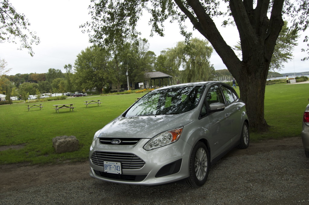
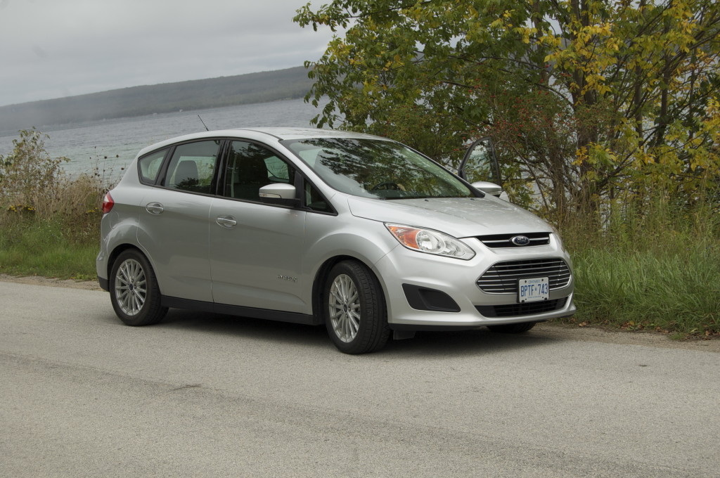
Ford C-MAX hybrid – general impressions
Fortunately, none of the gadgetry kept me from getting comfortable with the car, a Ford C-MAX hybrid four-door hatchback.
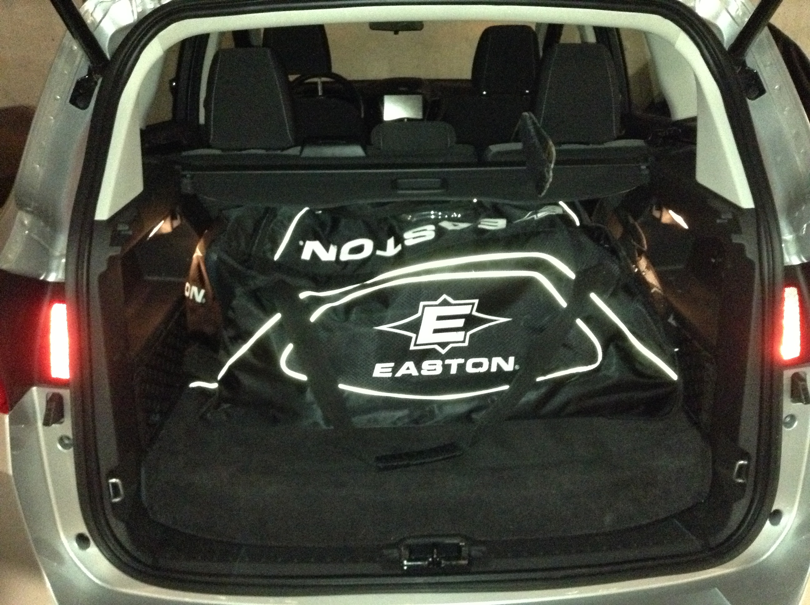
It’s a capable hauler that passed my primary cartage test.
The C-MAX is tall, so it offered ample headroom for my 6’5” frame and a comfortable ride for us, our hosts and their labradoodle.
Being a hybrid, the C-MAX was whisper-quiet going through my condominium parking garage. I sometimes found myself accelerating slower than usual just to see how long I could run the C-MAX on its electric motor. I soon tired of doing this, for reasons the following video ought to explain – if it doesn’t put you to sleep first.
I wasn’t expecting the oomph the C-MAX put out when I mashed the gas pedal to pass vehicles on the highway. Seems like Ford nailed both ends of the spectrum – economical fuel consumption plus respectable highway performance.
http://www.youtube.com/watch?v=-xVfvmbHteQ
(Yes, this video shows a realistic pass.)
Effectively reviewing in-car telematics and infotainment systems
Step one: list all the screens inside the car.
- one Microsoft SYNC with MyFordTouch centre console touchscreen
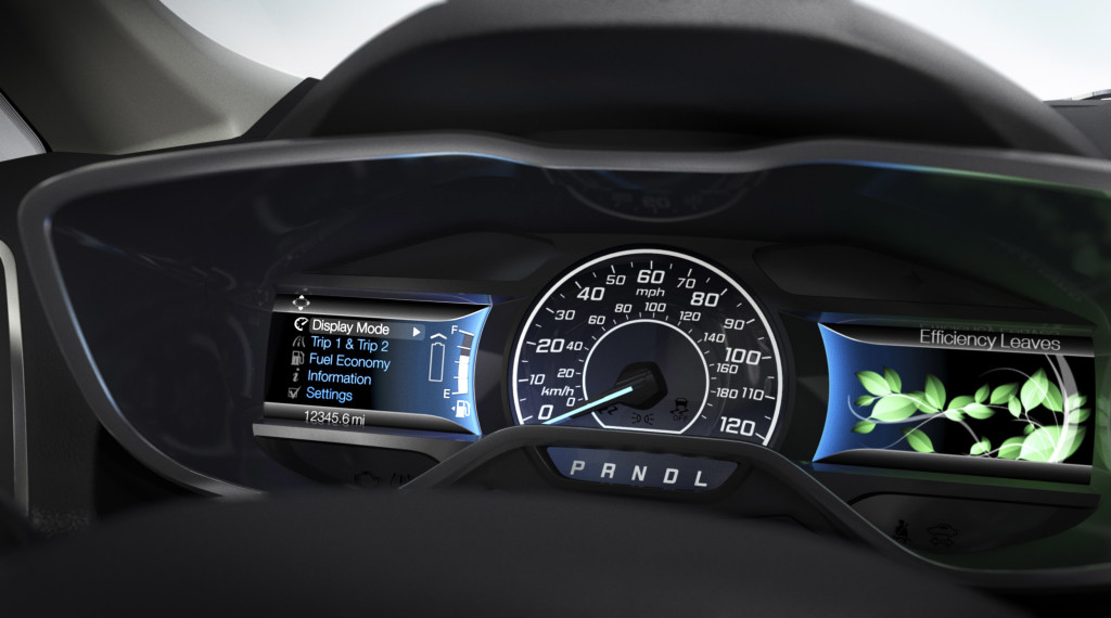
- two small video screens on either side of an analog speedometer comprising SmartGuage with EcoGuide
The C-MAX also responds to voice commands (more on those later).
These three screens provided too much information and too many options for me to grasp all at once. I didn’t want to play with any of the telematics while I drove, so I dove into the owner’s manual and Ford’s website while in my office and toyed with Ford’s MyFord Touch Guide smartphone app.
I also tried certain systems while parked, but that didn’t tell me how they worked while the car’s in motion. So I asked my girlfriend to drive the car to the cottage. During those several hours using the electronics from the passenger sear and reviewing the manual, I wrote the notes that became this blog post.
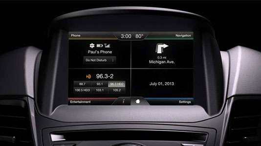
Centre console touchscreen (four corners)
Each corner of the screen contains a link to a group of controls (phone, navigation, entertainment and settings in the image below). Throw in a few icons at the bottom of the screen, including a Home icon to take you back to the main screen, and the overall screen layout proves logical.
Much the same can be said for most of the screens the home screen leads to, though some get a little too detailed for a driver to decipher while the car’s in motion. (More on that later.)
Dashboard video screens (video game controllers)
The smaller dash screens that flank the analogue speedometer provide less information, so they’re less likely to cause distraction. The left screen provides information about the vehicle’s performance, while the right screen cycles through summary information about the centre console touchscreen’s information. The right screen can also display leaves if you’re driving efficiently, becoming part of SmartGuage with EcoGuide.
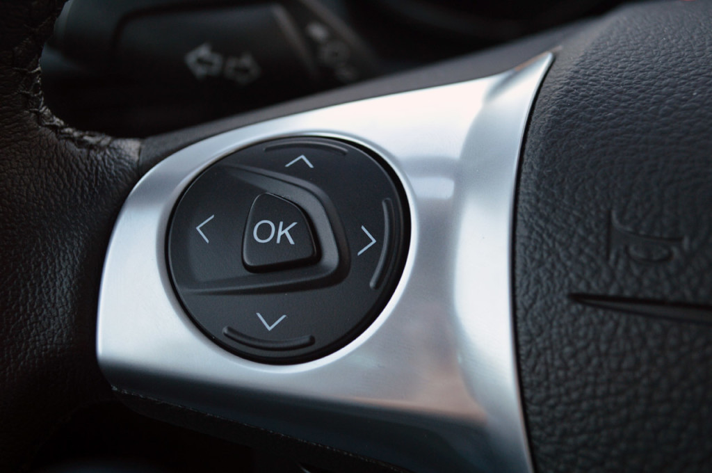
When the driver’s hands are at 9 and 3 on the steering wheel, the thumbs can easily reach identical “four-arrow” switches similar to the ones that control side-view mirror positioning. Video-game aficionados would recognize the design from console game controllers, with an OK button (not a “fire” button) sitting in the middle of the four arrows.
Each set of buttons controls the video screen on its side of the speedometer. Press the up or down arrows, and you can choose the things you want to view. The right arrow takes you to the choices you can make, the OK button lets you confirm said choices, and the left arrow takes you back to preceding lists of options. I scrolled through both sets of options before I settled on the ones I wanted to see, then largely left the buttons alone.
Coaching the driver
The left screen, as mentioned above, offered various ways to view the vehicle’s performance, essentially coaching me as I drove. I settled on a display that shows electronic versus gas engine output, and battery and fuel levels.
Braking caused the screen to display a spinning graphic on the battery, signifying the energy that I was putting into the battery by braking. Once I came to a full stop, the car told me how much of my braking effort made its way to the battery. I hit 100% by braking early and coming to a gentle stop.
Stopping the engine brought up a “braking score” that told me what percentage of braking energy the car captured during the trip. No 100% scores here, I’m afraid, but maybe with practice…
Voice-activated connectivity (not Siri)
We needed to pick up wine as a gift for our hosts, so we had to find an LCBO store en route. I “told” the car where we needed to go. The navigation system didn’t understand “Liquor store” or “wine store.” Both utterances led the system to a list of bookstores. Simply saying “liquor” did the trick, and finding a store en route proved easy enough from that point. (My girlfriend pointed out that we forgot to try “booze.”)
Voice commands are listed in various places in the manual, and the system will list them for you, offering to teach you on the go, but neither learning option proved palatable. I figured out my own compromise: I went as far as the touchscreen controls could easily take me, then engaged the voice-activated connectivity. With practice, I got the hang of it.
However, the “voice” of the car chastised me when I used the touchscreen to set waypoints using the navigation system during the trip to the cottage. This wasn’t entirely appropriate, since my girlfriend was driving at the time, but as somebody who regularly rails against distracted driving, I didn’t take the gentle rebuke as an affront.
BTW, here’s what Ford wants you to know about voice control. I think Ford is kidding about the handcuffs.
http://www.youtube.com/watch?v=V1okNm64mgM
In-car technology wish list
Producing truly intuitive technologies is the holy grail for every technology producer, and not every one hits the mark. That said, Ford did a decent job with the C-MAX’s in-car telematics and infotainment systems. I was getting comfortable with “all this” towards the end of the week I spent with the car.
However, I’d love to see Ford bake certain features into its systems. (These suggestions are not meant as putdowns. Few, if any, cars these days offer what I’m about to ask for.)
Tracking vehicle performance
I’m enough of a gearhead that I’d actually review how the C-MAX performed on each trip using a smartphone or a website. It would be more interesting than checking my Facebook feed (sorry, friends). It would feel safer than checking more information than I need to on the dashboard while I drive. Mechanics who diagnose a car’s problems might want this information too.
This isn’t a far-fetched idea. My Fitbit Flex activity-tracking bracelet sends information to my iPod Touch and my computer using Bluetooth. My Polar heart rate monitor tracks workout results and stores data for the last 15 workouts.
My iPod Touch was, in fact, paired to the car. Beefing up the MyFord Touch Guide app to the point where it receives vehicle telematics doesn’t seem like the biggest programming stretch. As a driver conditioned by decades of experience to keep my eyes on the road, I’d appreciate the effort.
Adopting technology that drivers already know
Listening to content on my iPod Touch (which runs the same operating system as the iPhone) means navigating different apps, not just the Music app. To listen to a podcast in the C-MAX, I had to choose the podcast app, then the podcast, on the iPod. Same thing for audiobooks – different app, specific files. Since I won’t pick up a handheld device while driving, I just stuck with whatever I was listening to during the trip I took.
This is the key reason why I found myself wanting Ford’s entertainment screens to include a “dumb terminal” that shows iPod’s screen instead of Ford’s, which I’m nowhere near as familiar with. I also wondered at whether Apple’s Siri voice-driven assistant could handle my navigation requests better than Ford’s assistant. In both cases, I already know how iOS and its apps work. I suspect people who use Android, Windows and other mobile operating systems would say the same thing.
I don’t fully endorse this design change, since it could easily lead to more distracted driving. But cars like the C-MAX have already let that cat out of the bag, and I can’t see manufacturers scaling back on in-car screens, so the distracted driving issue remains any way you slice it.
At least if Ford offered the option for drivers to use their phones via the car’s touchscreen, Ford would lessen the learning curve C-MAX owners face before they comfortably enjoy their in-car systems.
Final thoughts
The C-MAX, a capable and comfortable hybrid, contains in-vehicle electronics that took some effort to learn. That said, Ford’s design thinking came through in its logical layout of the four-quadrant touchscreen and the steering wheel-mounted controls for the dashboard screens. These design choices helped tame the complexity that often accompanies systems this sophisticated.
Where does Ford go from here? I see a road forward thanks to a report called Best Global Brands 2013, published by an outfit called Interbrand. Right at the top of the list: Apple Inc, maker of iPhones, iPads, Macs and other popular electronics gear. (Truth be told, Apple’s been hovering near the top spot of this particular ranking for years.)
As somebody who has used a variety of operating systems over several decades and has stuck with Macs since late 2007, I have my own theory about Apple’s success: they put sophisticated technology into the simplest conceivable packages. And Apple’s focus on simplifying is the one carmakers of all stripes need to take.
That degree of simplification hasn’t happened yet, and for good reason: personal computing comprises a much more mature set of technologies than do in-car systems. Consumers will cope, as we did when computer operating systems were more difficult to use. I’m confident that carmakers will follow the lead of computer operating system developers and make their in-car systems ever easier to use.
While I didn’t learn every feature the C-MAX offers (and I doubt most C-MAX buyers will either), I also have never learned every feature of the computers I’ve owned. Meanwhile, there’s enough useful stuff in Ford’s in-car technology offerings to improve your driving experience. Take a little time to learn it. If your experience is like mine, that learning will pay off.
