Several months ago, a friend upgraded from his 1987 Cutlass to a (drum roll please) top-of-the-line 2018 Honda Civic. Not being the most tech-savvy of people, he took me out for a ride in his new ride, hoping to learn a few things about all the flashing lights surrounding him.
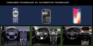
That got me thinking about how much change we’ve welcomed into the driver’s seat, and other areas of our lives. Representatives from Mazda North America recently hosted a lunch and learn session for journalists, and they drove this point home. I could write more about this, but I’d rather show this clip (the first of several) from Mazda’s presentation:

image courtesy Mazda
It’s a good reminder of how technology has been evolving through the 90s, 2000s and 2010s. And this evolution shows no signs of slowing down.
Types of driving distractions
Mazda also listed these three main types of driving distractions for us:
- Cognitive: taking the mind off of driving.
- Visual: taking the eyes off of the road.
- Manual: taking the hands off of the wheel.
It makes sense to minimize each type of distraction, thus keeping vehicle occupants safer.
Mazda explained its control and information layout using a number of other slides. I’ll show three more of them here.
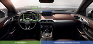
Minimizing cognitive distractions
I hadn’t realized this before, but Mazda does keep driving information in front of the driver and other readouts off to the right. That’s not the case with all automakers. For example, when a vehicle offers “Sport mode” the centre screen may show things like boost gauges.

image courtesy Mazda
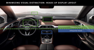
Minimizing visual distractions
I don’t want to look down when I look for information that I want at a glance. That explains both the segmentation in the following graphic and how things like gauges are designed.

image courtesy Mazda
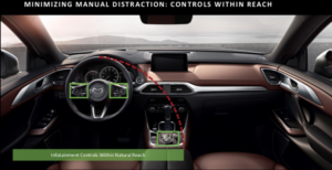
Minimizing manual distractions
Besides having a layout that’s easy to navigate by touch alone, the controls are mostly within easy reach. I have reached forward to touch the touchscreen (I dialled a phone number, which I cold have done using Mazda’s HMI controller) but aside from that, this graphic shows my experience in Mazdas.

image courtesy Mazda
How do other vehicles stack up?
The quick answer: it varies.
I have noticed (though disregarded) how I have stretched in the past to reach touchscreens. I also haven’t always gotten along with touchpads or the system layout. Mazda is a case in point: I’m looking forward to Apple CarPlay’s arrival in future Mazdas, since the Mazda Connect on-screen system does not make it easy to access music, audiobooks or other resources on my phone.
Don’t get me wrong. I like driving Mazdas. But even its representatives admit they are always striving for improvement.
Takeaways
Let’s add up what I took away from Mazda’s presentation:
- the admission they aren’t perfect
- an informative and insightful talk
- a fine lunch
- the idea for this blog post
- another structure to use when reviewing the in-car technology experience
Let’s dwell on that last point. Have you driven vehicles in which supplementary systems like infotainment proved easy to use (or the opposite)? Let me know in the comments below.