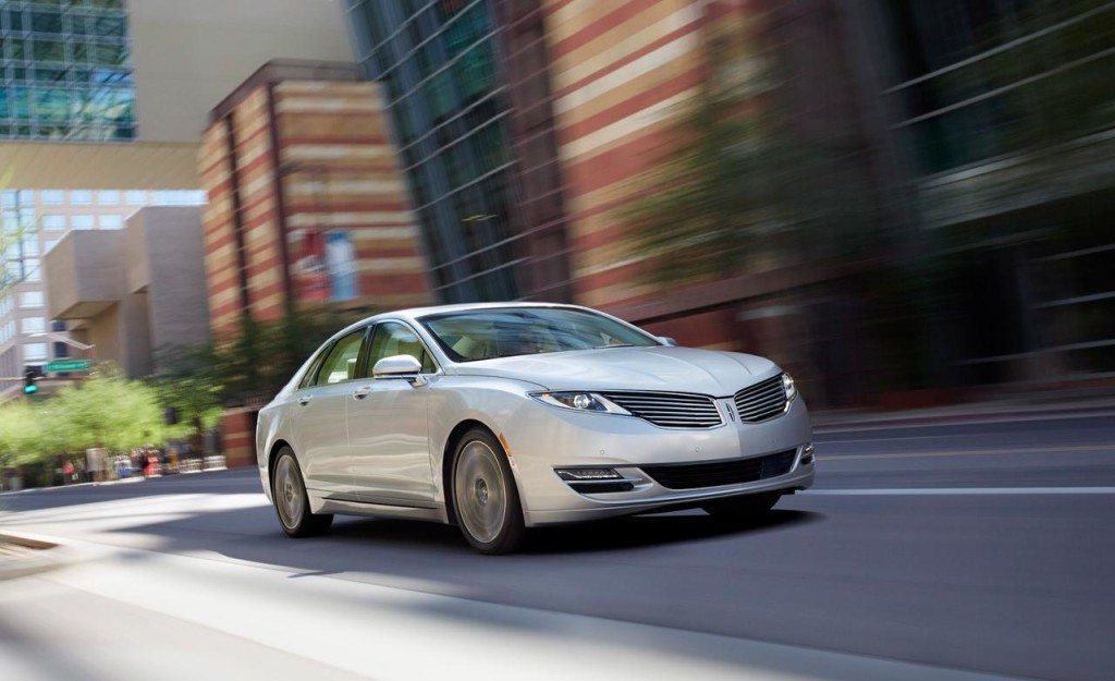
While I appreciate great style in all sorts of matters, from clothes to gadgets to cars, I inevitably choose practicality, even if it trumps style. You can have both – well, almost – in the 2014 Lincoln MKZ Hybrid.
You can’t question the style of the MKZ, whether you’re outside or inside the car. My tester, the hybrid model, hid its 2.0L Atkinson-cycle 4-cylinder gas engine and electric motor, which combine to generate 188 net horsepower, behind a slightly sloping split-wing grille and under a subtle hood that smoothly joins the many parts which combine to form the Lincoln’s understated elegance.
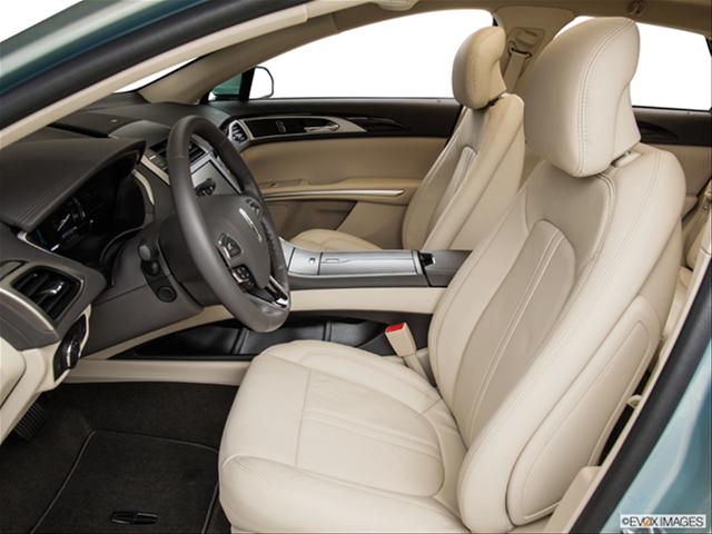
Step inside over the illuminated doorsill and the story is much the same. My tester’s white exterior and beige leather interior were accented by ambient lighting that followed the car’s lines.
All the “mod cons” you would expect from a luxury sedan are here: heated steering wheel, four heated seats, cooled seats for comfortable summertime cruising to formal business appointments, and so forth.
The driver’s seat fit like a glove from the moment I sat in it. Turn off the engine and it retracts to give you more room to get out. (I presume it doesn’t do this if a passenger is sitting behind the driver.) The headrest felt like it was in just the right place.
Everything fit perfectly right up to the panoramic sunroof. My skull cleared the sunroof. My short hair, not so much. This isn’t what you’d expect from a car that shares its lineage with the Lincoln Lawyer’s ride. Looking in the mirror after getting in from a drive, I could see the ridge in my hair where my head rubs up against the sunroof’s border. I didn’t really mind this, since I’m not the most fashion-conscious guy around. (The noise you hear in the background, and can disregard, is my girlfriend sighing in agreement.)
This sunroof really is panoramic. It quietly lifts and slides back on rails to the point that it covers all but a foot of the rear window, leaving a very generous opening up top. It’s a wonder to watch in motion as well.
http://youtu.be/1SHPnk443XY
The consistency of roof curve from the top edge of the windshield to about a foot from the trunk contributes to both the feasibility of the roof’s sliding open and the car’s overall elegance.
Safety features abound, from the standard bits to available inflatable rear safety belts to the available Blind Spot Information System (BLIS – I sense a bad pun coming on…). It’ll warn you of vehicles traveling in your blind spot or crossing your path when you back out of a parking space, two situations in which ignorance is not bliss (sorry).
Lincoln tucked a brake switch, a very short lever, under and to the left of the steering wheel. It befuddled me at first, so I taught myself to use it properly by thinking of it like this: I pull a conventional lever up to engage the brake and lower the lever to disengage it. The Lincoln’s lever works the same way.
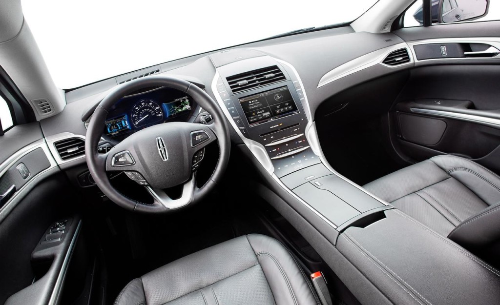
Two screens flank the analog speedometer, each one controlled by “five-point” buttons on the steering wheel. The left screen provides engine performance data, and I set it to show output from the gas and electric engines, as well as the battery charge and fuel level.
The right screen summarizes information from the touchscreen mounted on the center stack. I chose to have this screen show the next turn as directed by the navigation system.
Lovely gaps in the center console running from under the dash to the storage cubby under the driver’s right elbow gave a very “Star Trek” look to the interior. Those gaps, while lined with a non-slip surface, didn’t elicit thoughts of specific things to store there, though I’m sure they could acquire both useful stuff and collections of daily driving detritus over time.
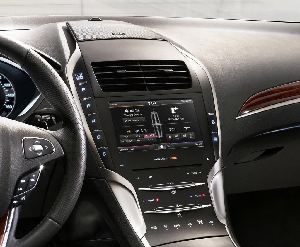
The Star Trek look extended to a completely smooth center stack below the touchscreen. You touch an icon on the stack surface to activate a feature, whether for radio or climate controls. Run your finger along the two horizontal silver bars to control sound volume and climate control fan speed.
The only buttons that you push are the ones that flank the stack: start/stop engine and transmission buttons on the left, a couple other buttons on the right. The look is part of what Lincoln refers to on its website as “Elegant simplicity (that) enhances the clean, uncluttered appearance that characterizes the whole of the interior.”
The big touchscreen shows a “four-quadrant” control setup found on Fords and Lincolns. Reaching for this screen, I inadvertently touched a button on the transmission with my thumb once or twice, fortunately while at low speed. Lesson learned: you need to hold the wrist up so that you don’t touch transmission buttons while the fingertip makes contact with the touchscreen.
Since controls on the stack below the touchscreen lack tactile buttons and knobs, I disregarded them while driving and used the touchscreen and the controls on the steering wheel instead. While I concede that this “smooth stack” makes for a visually pleasing environment, I couldn’t get beyond the need to take my eyes off the road to use these controls and how nervous I felt doing so.
I also took issue with the headlight knob, located as it was on the dash behind the steering wheel. I needed to bend forward to use it, something I don’t think I’ve done in many modern cars. Side-view mirror adjustment controls are also a bit far, almost at the front of the door where it meets the hinge on a downward-sloping armrest.
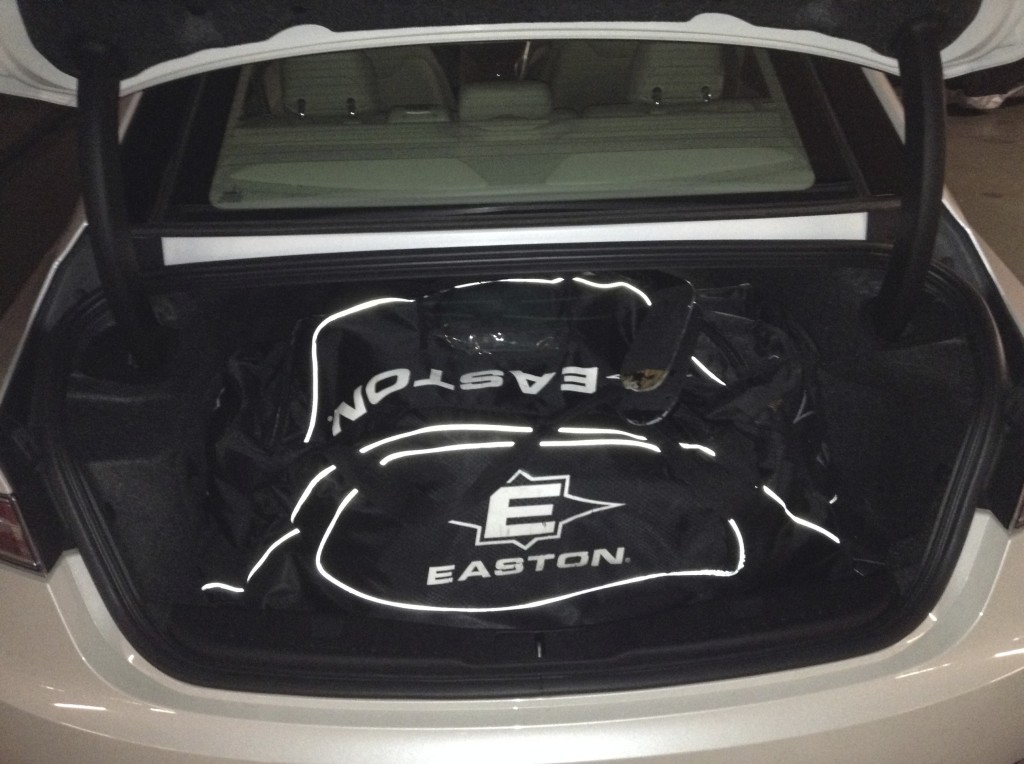
Back in the practicality camp, my hockey bag sits easily enough in the trunk, even though the trunk floor “steps up” a few inches about a foot behind the rear seats to accommodate the electric engine’s battery. I slid my sticks through a flip-down armrest opening.
Lincoln’s designers showed real imagination laying out the interior as they did. I hope they go back to the drawing board for the layout of climate and radio controls to make them as practical as the entire car is elegant and a pleasure to drive.
