originally published in National Magazine
Note: This article won a 2010 Kenneth R. Wilson Award.

2010 Kenneth R Wilson Award Best in Canadian Business Publishing
What makes a law firm website great? What should it be trying to accomplish, and how do we know if it succeeded? We asked some of Canada’s top legal technology experts to tell us which law firms are doing it right in 10 different categories. The results of this nationwide survey are here in National‘s inaugural Best Canadian Law Firm Website Awards.
Have you ever wondered how leading Canadian legal websites compare? We did, so we asked a panel of nine legal technology professionals, representing a diverse range of professions (web designers, consultants, law students and lawyers) to rank and comment on Canadian law firm websites within different categories. What you’re about to read are their answers and valuable insights, as well as their choices for best law firm websites in Canada.
The overriding design principle that our experts recommended for good law firm websites is to keep it simple. Law is a complex field, but few clients want to deal first-hand with that complexity.
“In general, I tossed out firms where I had to scroll down to get all the information on the page, especially the home page,” says Toronto lawyer and Legal Post columnist Mitchell Kowalski. “If the home page didn’t fit 90 percent on my initial screen, then it was deemed to be too crowded with information and, quite frankly, too much work to figure out what the firm was about.”
“As someone who creates and manages web assets, I know first-hand how hard it can be to convince any client to allocate the significant resources and manpower to distill their content and message,” says web designer Jesse Collins of Mississauga, Ont. “Ironically, it requires a lot of work, time and money to make things simple, clean and spare.”
While panelists agreed on the importance of a site’s simplicity, they also emphasized maximizing the site’s curb appeal. In the opinion of e-discovery consultant Peg Duncan of Ottawa, “the most important stuff for the home page of national law firms is the list of recent matters and news, as well as links to blogs and RSS feeds.” Though, as Dominic Jaar of Montreal points out, too few firms update their news regularly.
Those sorts of elements “demonstrate a firm’s currency and whether or not they ‘do’ what the client might be looking for,” adds Marni MacLeod, client services director for Skunkworks Creative Group in Vancouver.
Panelists concurred that blogs benefit a firm. They also agree that blogging requires an ongoing commitment to reap benefits. So if making the time to blog proves difficult, get students to help. That’s happening at Cassels Brock & Blackwell’s articling student blog. “The firm gets an ‘A’ for effort,” says Kowalski. “And kudos for apparently not censoring what the students write.”
Another approach is the team blog, such as the Video Game Law Blog at Davis LLP, which features multiple contributing lawyers. Another tactic is to stray from legal topics now and again, as Toronto lawyer Garry Wise does on his own blog. You can attract more potential clients, Kowalski surmises, by creating “a destination blog that many people will go to.”
Toronto lawyer Rob Hyndman employs the same tactic on his own blog. “By reflecting on his involvement in technology and events like the HoHoTO [charity event] and the Mesh Conference, he speaks to the type of person he is and why you’d want to do business with him,” Kowalski says. “For me, that’s what blogging is supposed to deliver.”
For all this talk of content, the superficial can’t be ignored. “Unless I’ve been specifically referred ? and some practices are heavily referral-based ? if the home page is ghastly, I go no further,” MacLeod says. “Just as with meeting a person, viewing a website in the absence of any physical contact with a lawyer at that firm means their website is really my first impression.” It doesn’t help, says Jaar, when the first image you see on a law firm website is a terrible photo of one of the partners or, even worse, of an empty office or reception area. “It’s like I’ve just walked into a furniture store or I’m looking up some insurance salesman.”
Lawyer biographies drew plenty of attention. In MacLeod’s view, “a relationship with a lawyer is very personal. Clients trust them with private information, and how they perform will have a significant impact on a client’s well-being.” Bios, especially those adorned with professionally produced photos, that present lawyers (and, increasingly, other staff) as approachable and “real” enhance a first impression.
Law student and blogger Omar Ha-Redeye believes good bios are the exception today. He sees bios that vaunt lawyers instead of providing useful information to clients. “When looking for a lawyer, most clients could care less about the things that lawyers care about, [like being a] Gold Medalist, or having clerked with so-and-so,” he says.
“I would love to see social media linked from profiles (e.g., a lawyer’s blog), but this rarely, if ever, happens,” he adds.
Collins singles out Alexander Holburn Beaudin & Lang LLP for its client focus. “The copywriting is particularly user-focused,” he says. “No businessy, legal-schmegal BS, no buzzwords. Just things like: ‘Take a look around – perhaps we can be of service,’ or ‘Students play an essential role at Alexander Holburn Beaudin & Lang LLP. We look to them as the principal source of the firm’s growth.'”
“Wow, speaking like a real person!” he says. “That means that they might actually be able to present a legal issue and possible solutions to me in a way that I can understand.”
Before signing up, prospective clients usually want to know the cost of doing so. There’s no consensus on the value of posting prices on websites, but that didn’t stop Heritage Law from placing its “Value Pricing” link third from the left on its menu bar, just under the firm logo. Slater Vecchio’s website offers the other side of the financial equation: a trial damages awards page. “Compensation is of paramount importance to many personal injury victims,” says MacLeod.
Heritage Law also shows how websites can effectively merge various technologies on one site to serve clients ? particularly online payment ? as well as prospective clients. “There’s up-to-date valuable information in a variety of formats: web copy, videos, blog, Twitter,” says Allison Wolf, president of Shift Works Strategic Business Coaching in Vancouver, adding that these features give “a real feel for the firm.”
A word of caution concerning bells and whistles like animations and sound: make sure they work. For instance, MacLeod diplomatically notes that “a national firm, which shall remain nameless, has a great site overall. But I was unable to view their Student Recruitment page because it required an archaic version of Flash to play.”
“Flash kills your SEO (search engine optimization)” Ha-Redeye adds. That said, he likes “the embedded full-body video of the CEO on the Gowling Lafleur Henderson LLP homepage. It’s really innovative, and works! Not only does it provide a clear and concise greeting, but the body language is open and giving.”
Steve Matthews, principal of Stem Legal Web Enterprises in Vancouver, also likes Fraser Milner Casgrain LLP’s practice pages and how they clearly identify appropriate contacts. “This sounds like a simple feature, but it’s remarkable how many firms make it difficult to contact them,” he says. “Hiding or removing email addresses and phone numbers is never a good business practice.”
Now that you know how to create a great law firm website, here are our judges’ picks for the very best websites Canadian law firms have to offer in various categories, along with their comments on what put them over the top.
The Top Picks
Big Firm (multi-jurisdictional)
Winner: Ogilvy Renault LLP
Mitchell Kowalski: The site is clean, crisp and uses modern colours which give the impression of a firm that is progressive. It uses links to jump you to other information instead of forcing the reader to scroll down pages. The site also posts an annual review of what the firm did in the past year – very innovative.
Marni MacLeod: I liked the feature box, but it was not that intuitive you were supposed to click on successive pages. I also liked the Featured Publication and the signup for news (you can pick and choose what practice areas interest you) Everything current was on the Home Page, including recent client work which I think is critical for a large national firm.
Honourable mentions: Gowling Lafleur Henderson LLP, Fasken Martineau DuMoulin LLP
Small Firm/Solo
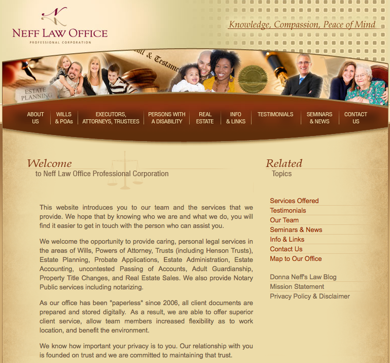
Co-winners: Hyndman Law and Neff Law Office
Mitchell Kowalski: “It’s a great small firm site that is warm and inviting to personal (not corporate) clients. The site makes you want to meet with Donna Neff and give her your business.”
Steve Matthews: “Rob Hyndman’s website has four linked pages: who, what, where, and blog. It describes his background, practice, types of mandates he takes, and how to contact him. Yes it’s simple, but it also demonstrates that it doesn’t take much to create a credible image online.”
British Columbia
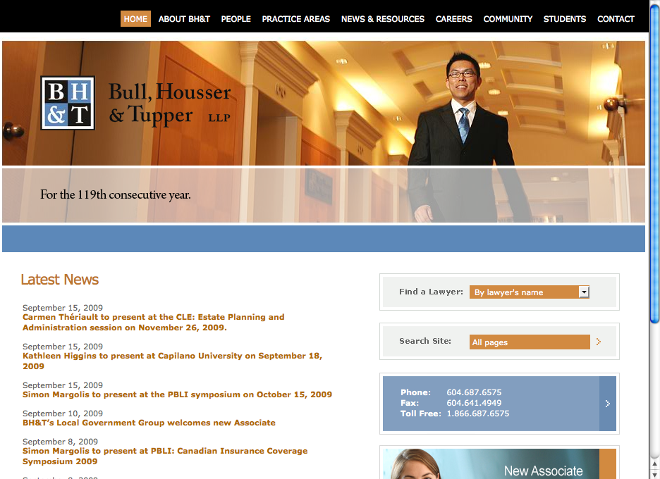
Winner: Bull, Housser & Tupper LLP
Allison Wolf: “A great home page design. It’s all at your fingertips: lawyer locator, address, lawyer spotlight feature, news and the usual navigation bar. Not much scrolling is required on the homepage, even on my tiny laptop screen.”
Mitchell Kowalski: “What stands out about this firm is the brilliant use of materials to show they are diverse, without saying so.”
Honourable mention: Clark Wilson LLP
Prairies
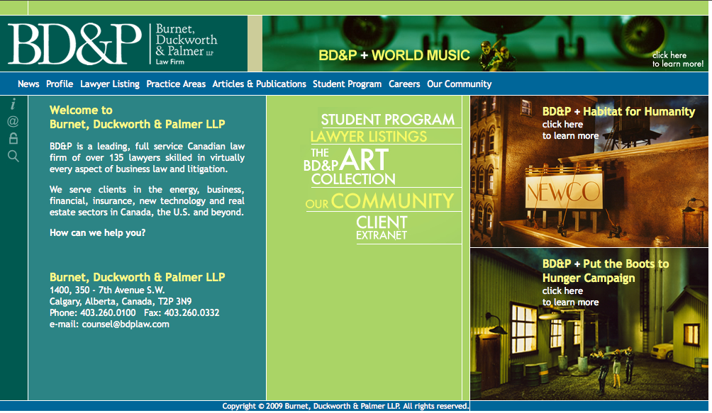
Winner: Burnet, Duckworth & Palmer LLP
Connie Crosby: “Burnet, Duckworth & Palmer aren’t afraid to be different with their site. They have done it big and bold. They include other professionals in addition to their lawyers in the directory.”
Omar Ha-Redeye: “I usually dislike a cluttered website. But this one was interesting given the prominent focus they give their pro bono and community work. I know there are other firms that do this kind of stuff, but making it a high priority is what’s needed in law right now.”
Ontario
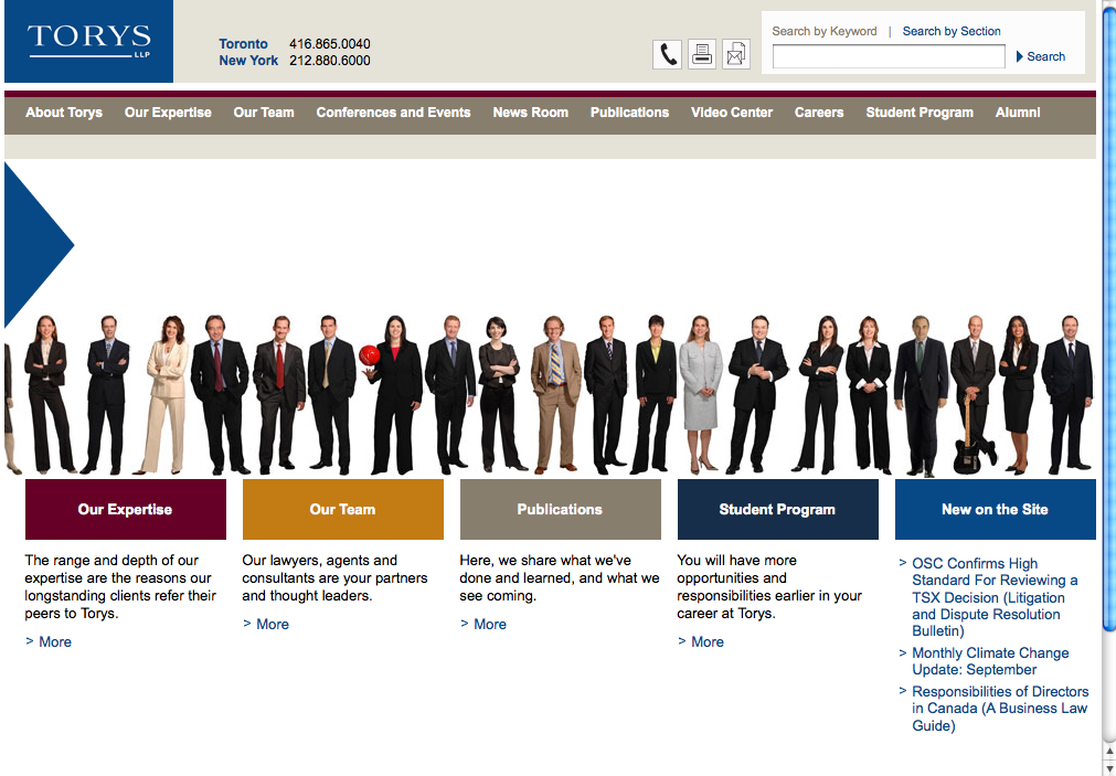
Winner: Torys LLP
Allison Wolf: “I like to see real people on law firm web sites, not just more photos of empty boardrooms. It’s inclusive. It shows that a firm is made up of many, not just the noteworthy few. The website also features an extranet site for alumni.”
Marni MacLeod: “The Flash intro was distinct and the lawyers looked like “real” people. I also liked their video centre.”
Honourable mentions: Hicks Morley Hamilton Stewart Storie LLP, McMillan LLP
Eastern Canada
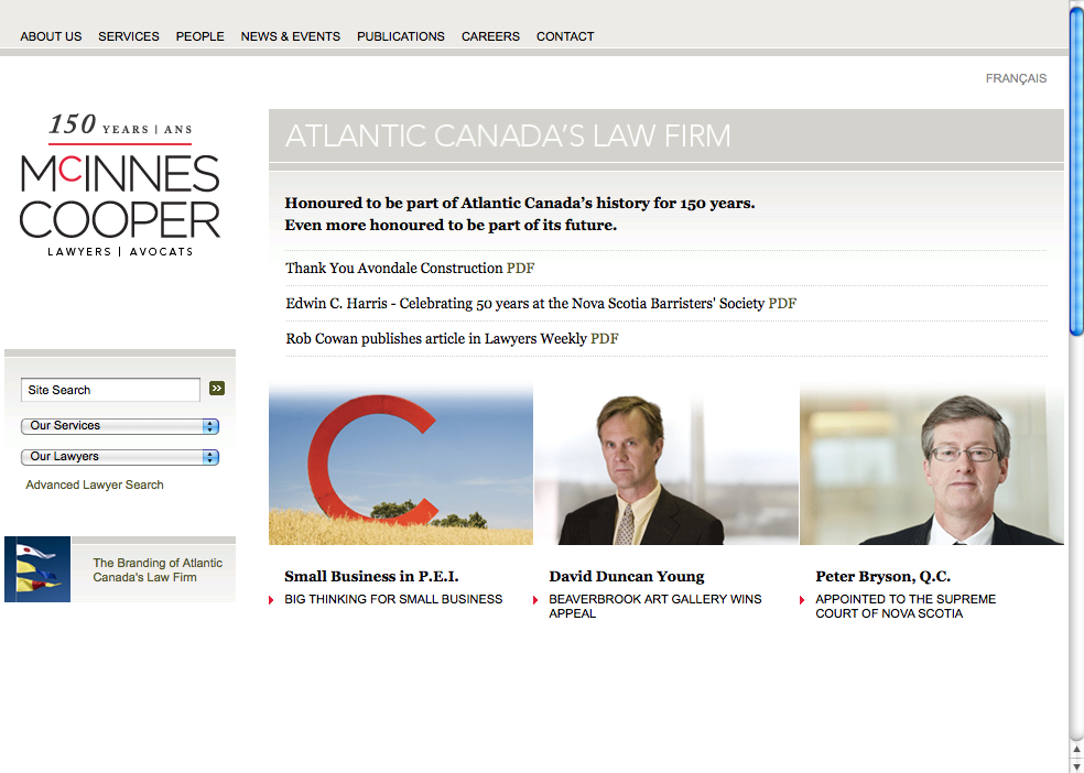
Winner: McInnes Cooper
Mitchell Kowalski: “It’s a clean, smooth site that is succinct and pithy, the way a good website should be. It is up-to-date and not overloaded with information. The site might appear somewhat bland in terms of colouring, but it does give a feeling that this firm is modern.”
Jesse Collins: “The site is minimalist and well-organized, perfect for quickly getting a feel for the firm. It’s important to remember that the average user scans a site quickly, and this one suits that approach. I especially like the drop-down of services to quickly establish if the firm’s a fit for a given prospect.”
Honourable mention: Cox & Palmer
Québec
Winner: Legault Joly Thiffault
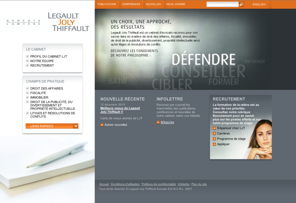
Legault Joly Thiffault avocats web site
Dominic Jaar: “The content is well organized, and it has a great look and feel. The colours are sober and appropriate. Navigating the site is very intuitive. On the homepage, some key words are flashing – defend, advise, target – that send a clear message about the image they want for themselves. Everything you need to know about the firm is on that first page, including recent news (even though it’s a bit out of date}. You can easily jump from English to French, something many firm sites cannot do. The search engine works well, which is not always the case for other sites. They also have a strong recruiting page.”
Honourable mentions: Bélanger Sauvé, Lavery
Blogs
(This category only includes law blogs created and maintained by law firms.)
Co-winners: Davis LLP and Clark Wilson LLP
Kowalski praises both winners for social media best practices, including RSS feeds, Twitter connections and the cornerstone of blogging, regular updates.
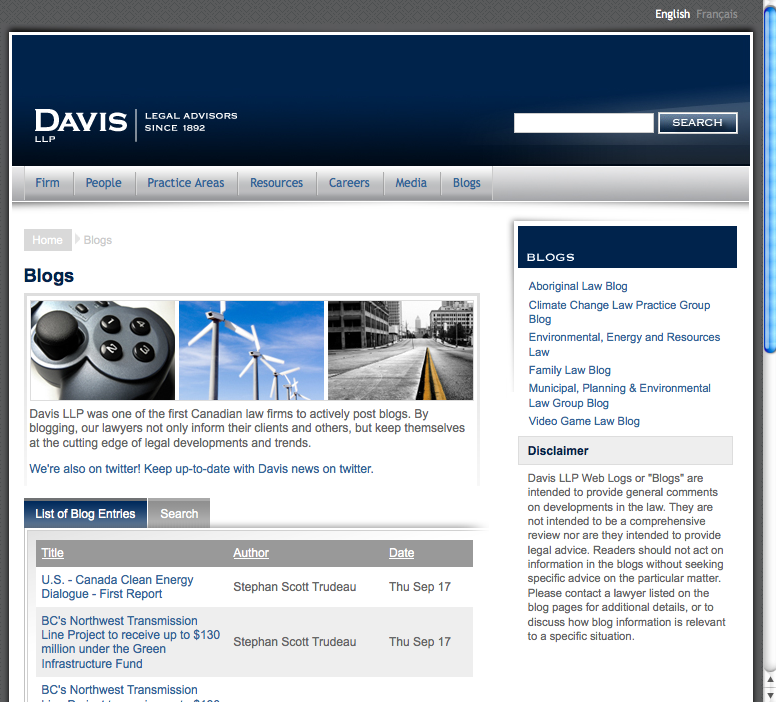
Davis law firm blogs web page
Allison Wolf: “Of all Canadian firms, Davis LLP maintains the most blog sites (five). No firm is putting an emphasis on blogs like Davis.”
Domine Jaar: “A surprising absence of law firm blogs in Quebec.”
Multimedia
Winner: Hull & Hull LLP
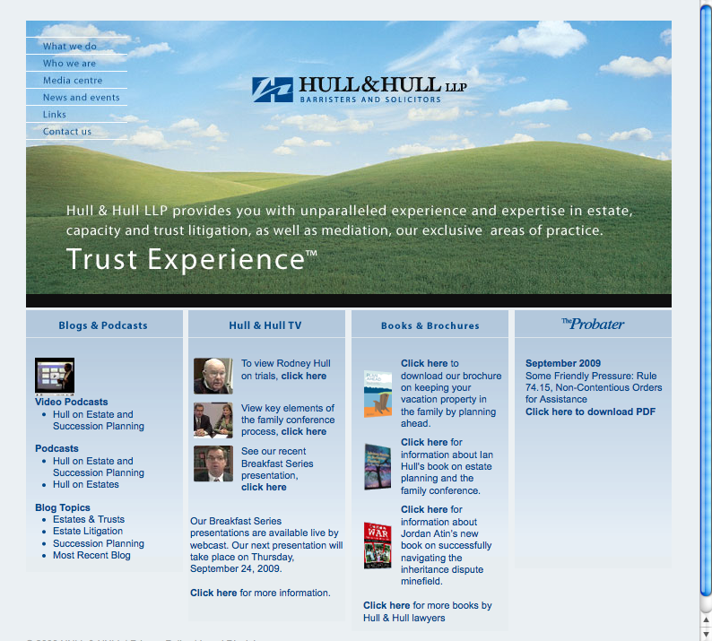
Hull and Hull law firm web site
Connie Crosby: “They are the only firm that has truly experimented with video and podcasting in a big way. The others I saw don’t understand that they need to produce episodes on a regular basis to explore a subject area, or that podcasts and videocasts need an RSS feed to be syndicated. Hull & Hull gets that.”
Omar Ha-Redeye: “They’ve probably been doing it as long as anyone, and have fully integrated videos and podcasts into their practice. Experience with these formats has not only resulted in a highly polished product, but also content that is actually relevant to what they do.”
Honourable mention: Torys LLP
Student/Recruiting
Winner: Bull Housser & Tupper LLP

Bull Housser & Tupper student & recruiting web site
Allison Wolf: “Bull Housser and Tupper’s student micro site – in particular the three videos featured in BHTV – are outstanding. The firm culture and work videos featuring candid comments from numerous Bull Housser associates are excellent. They provide students with valuable insight into the firm.”
Mitchell Kowalski: “It’s well laid out and very easy to navigate. They use good colours and the innovative BHTV concept.”
Our Judges
- Jesse Collins, Web Designer, Moxy Inc., Mississauga, Ontario
- Connie Crosby, web presence and knowledge management consultant, Crosby Group Consulting, Toronto
- Peg Duncan, e-discovery consultant, Ottawa
- Omar Ha·Redeye, law student, University of Western Ontario
- Mitchell Kowalski, lawyer and Legal Post columnist, Toronto
- Marni Macleod, Client Services Director, Skunkworks Creative Group Inc. Vancouver
- Steve Matthews, Principal. Stem Legal Web Enterprises, Vancouver
- Allison Wolf, President, Shift Works Strategic Business Coaching, Vancouver
- Dominic Jaar, President Conseils Ledjit inc./Ledjit Consulting Inc.
For a PDF of this article, click canadas_best_law_firm_websites.


Luigi, a great article. Well-done.
Shane